News
The Anatomy of an Optical Illusion: What That Viral “Unreadable” Arm Tattoo Teaches Us About Design

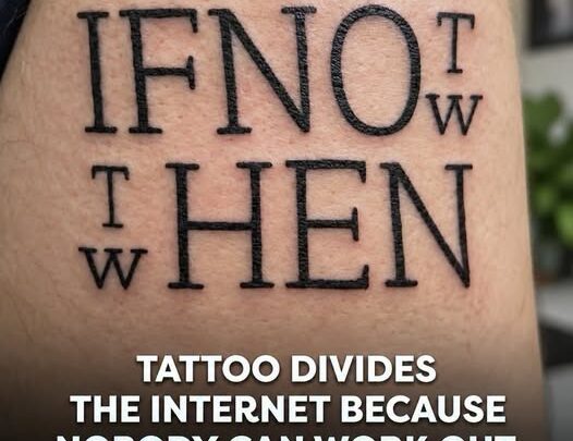
I was sitting at the kitchen table yesterday with a steaming mug of black tea, lazily scrolling through my morning feeds, when an image stopped my thumb mid-swipe[cite: 1]. It was a close-up photograph of fresh black ink on someone’s forearm[cite: 1]. At first glance, my brain refused to process what was printed on the skin[cite: 1]. It looked like a scramble of oversized block letters crammed into a tight square grid, flanked by tiny stray consonants drifting like lost punctuation marks[cite: 1].
I tilted my screen to the left. I squinted. I held the phone at arm’s length, wondering if it was written in another dialect or perhaps served as an inside joke between close friends[cite: 1]. Thousands of commenters were just as perplexed, tossing around wild theories, poking gentle fun, and turning the visual puzzle into a viral sensation overnight[cite: 1].
Yet behind the viral amusement lies a fascinating lesson in design. Whether you are planning your first meaningful tattoo, cutting adhesive vinyl for a DIY pantry sign, or framing a beloved quote above your entryway table, avoiding quote typography mistakes is what keeps your sentimental words from turning into an unintended riddle.
Deconstructing the Puzzle: Why Your Brain Froze on “IFNOT T/W HEN”
Once you see the solution, it feels almost comical how simple the hidden sentence is: “If not now, then when.”[cite: 1] It is a timeless, reflective phrase meant to spark immediate action. But why did so many people struggle to read five short English words?
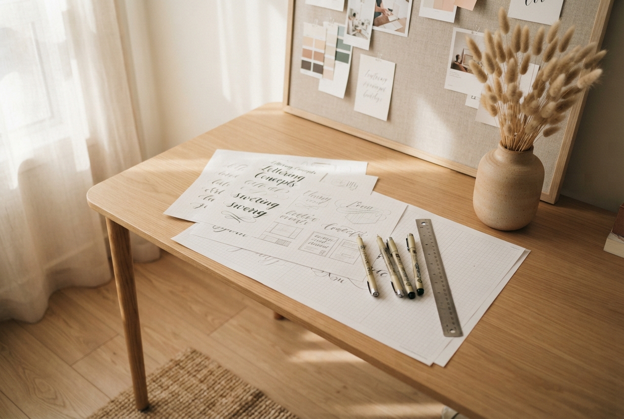
Testing layout ideas on paper first reveals awkward letter spacing before anything becomes permanent.
The confusion boils down to how our visual processing system handles text. As humans, we read via pattern recognition. Our eyes scan from left to right, grouping characters based on baseline alignment, spacing, and word shapes. In this viral design, the artist tried to construct an ingenious visual crossword where letters pull double-duty[cite: 1]:
- The First Line: The large letters spell
IF NO, paired with a smallTstacked directly on top of aW[cite: 1]. The top smallTborrows theNOto spell “NOT”[cite: 1]. Simultaneously, the bottom smallWattempts to borrow the sameNOto spell “NOW”[cite: 1]. - The Second Line: On the left side, another stacked
TandWsits in front of the large lettersHEN[cite: 1]. Pairing the topTwithHENproduces “THEN,” while pairing the lowerWwithHENcreates “WHEN.”[cite: 1]
In theory, the mathematical symmetry sounds brilliant. The creator wanted a compact, interlocking block of text where every character served two purposes. In reality, our brains do not naturally parse two distinct words from a single shared syllable on the exact same line. Instead of seeing a profound motto, our eyes saw an anagram: “IFNOT TW THEN TW.”
4 Subtle Quote Typography Mistakes That Ruin Great Words
We have all seen signs, prints, or tattoos that make us pause and scratch our heads. Usually, the issue is not bad grammar or ugly handwriting; it is an over-complicated layout. Here are four common pitfalls to watch out for when planning your next lettering project.
1. Choosing Cleverness Over Clarity
There is a strong temptation when designing something meaningful to make it visually complex. We want secret meanings, hidden monograms, or overlapping letters that reward a closer look. But readability should never be an afterthought. If someone has to stare at your dining room wall art for two minutes just to decipher the phrase, the emotional resonance of those words gets lost in the struggle.
2. Breaking the Natural Reading Flow
Western reading habits rely on clear horizontal baselines. When you float letters between lines, stack consonants in tiny corners, or scatter words diagonally, you force the reader’s gaze to jump around like a pinball. Compact spacing can save physical room, but tight boundaries often choke the natural rhythm of the sentence.
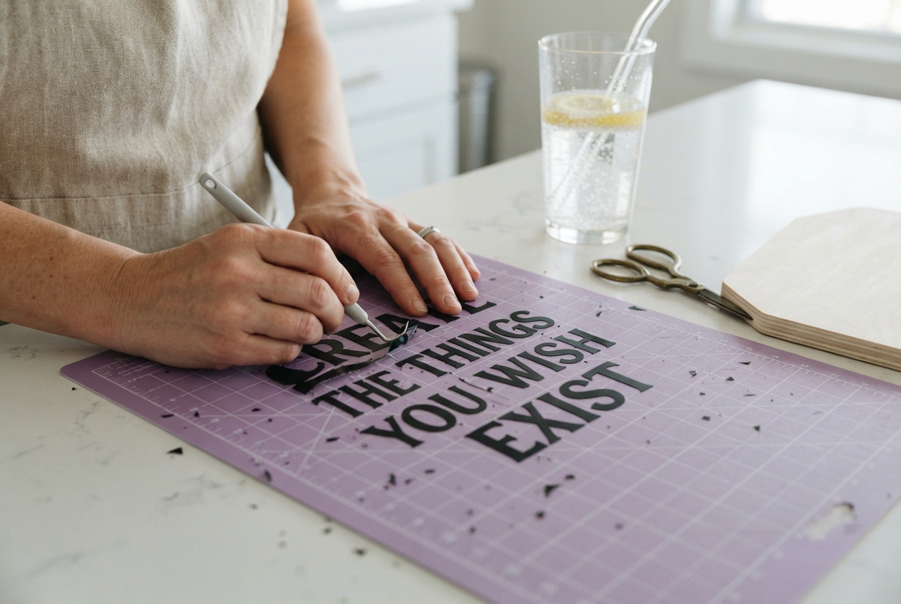
Crafting vinyl signs requires close attention to letter baselines so words remain readable across the room.
3. Forcing Letters to Do Double Duty
Shared letterforms work wonderfully in crossword puzzles and company logos where the viewer expects an optical trick. For inspirational quotes, however, shared characters almost always trigger a cognitive logjam. Give each word its own space on the page. Repeating a three-letter word like “now” or “then” takes up minimal room and saves everyone from a headache.
4. Forgetting About Physical Mediums and Scale
A design that looks sharp on a glowing 27-inch computer monitor might behave completely differently in real life. On human skin, ink particles gradually settle and soften across the years, meaning tiny stacked letters can eventually blend together. On raw timber or textured linen, paint can bleed into the grain. Always test your text at the actual physical scale it will inhabit.
From Body Art to Home Decor: How to Use Typography in Everyday Living
You do not need to be a professional graphic designer to create gorgeous text layouts around your home. Whether you are stenciling spice jars, stitching a customized sampler, or building a seasonal gallery wall, keeping type clean brings a quiet elegance to your space.
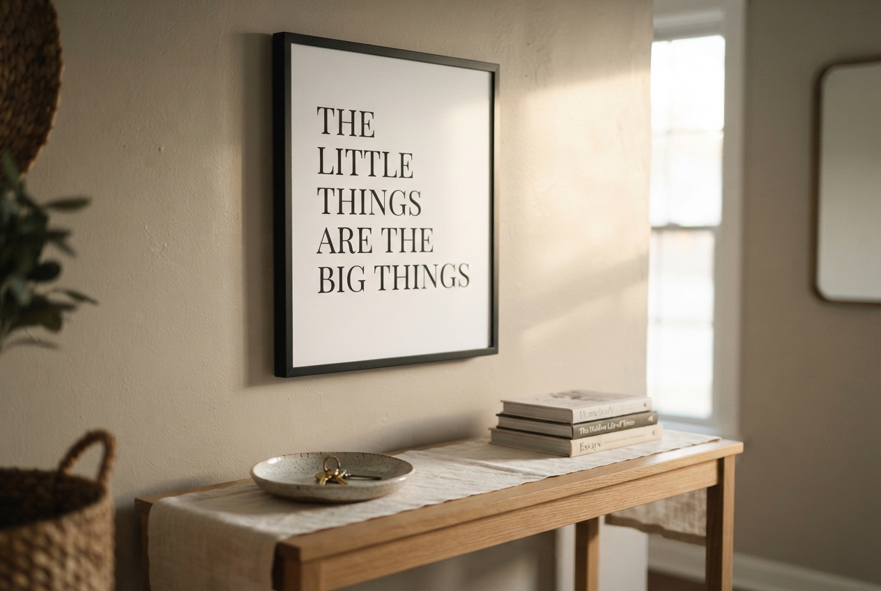
Generous white space and classic serif typefaces turn simple quotes into calming home accents.
When decorating with text, negative space is your greatest asset. Leaving ample blank margin around a quiet quote lets the eye rest. Instead of packing words together to fill an entire picture frame, let the paper breathe. A delicate, centered phrase with generous white borders feels intentional, peaceful, and grounded.
“True simplicity in design is not about stripping away personality; it is about removing every obstacle between the reader and the sentiment.”
Font pairing is another place where restraint pays off. If you are mixing two styles—such as an organic handwritten script with a structured printed font—keep the balance simple. Let one font handle the heavy lifting while the other acts as a subtle accent. Avoid using more than two typeface families in a single piece, and make sure their scale creates a natural hierarchy.
The 24-Hour Test: A Quick Checklist for Permanent Projects
Before you commit any design to skin, wood, fabric, or paint, put it through this practical sanity check:
- Print at 100% Size: Never approve a design from a phone screen alone. Print it on standard paper at its true finished dimensions and tape it up where you can see it.
- The Five-Foot Glance: Step five feet away in ordinary daylight. If you cannot read the sentence within two seconds of glancing at it, the spacing needs adjusting.
- The Stranger Test: Show the printed layout to someone who has never heard the quote before. Hand it to your neighbor or a friend over iced mint tea and watch their face. If their eyebrows furrow or they tilt their head, ask them where their eyes got stuck.
- Sleep on It: Set the design face-down overnight. When you look at it with fresh eyes the following morning, your brain will catch spacing quirks and misalignments that you missed the day before.
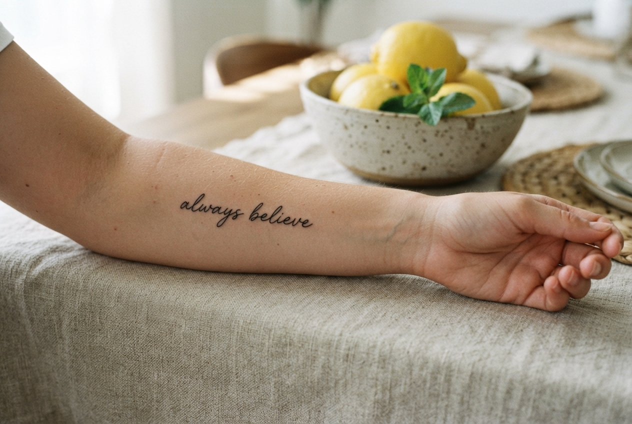
Minimalist script with open letter loops stays crisp and readable on skin as the years pass.
Words Worth Sharing
The viral sensation surrounding that enigmatic arm tattoo reminds us how deeply drawn we are to words that inspire us[cite: 1]. We carve quotes into stone garden markers, stitch them onto tea towels, and trace them across our skin because language anchors our memories and daily aspirations.
When you take the time to sidestep common quote typography mistakes, your message shines without friction. Great lettering does not demand a decoding key or a team of internet sleuths to appreciate[cite: 1]. When form and function work hand-in-hand, your chosen words deliver their wisdom clearly, warmly, and effortlessly for years to come.